Graphic design illustrates the world around us, acting as a conductor of ideas and building the systems of information which allow us to move smoothly through our days. It’s a functional tool, deployed in city planning, economic stimulation, and political movements. It’s also a creative and beautiful form of expression. With minds like Pierre Mendell cleverly casting cultural events into visual vernacular and Margaret Calvert building the language of British transit, graphic design is raised up to new heights where we can simultaneously appreciate it for its aesthetic and utilitarian value. To shine a light on this often-unsung form of cross-linguistic communication, we’ve gathered a few of the best and brightest graphic designers from recent history…
German graphic designer, Pierre Mendell’s body of work is defined by a fresh, clen-cut modernity and a reductive mentality. True to his roots, he took a very orderly approach to his designs, with graphically led posters that were high on impact and low on text. He often incorporated real-life elements, using photography to bring the outside world into his posters.
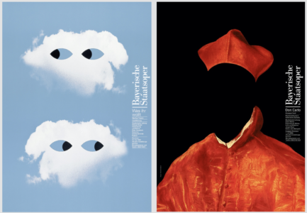
Pierre Mendell’s Was Irh Wollt (The Twelfth Night) poster for Bayerische Staatsoper (Bavarian State Opera), 1998 (left) + Pierre Mendell’s Don Carlo poster for Bayerische Staatsoper (Bavarian State Opera), 1999 (right)
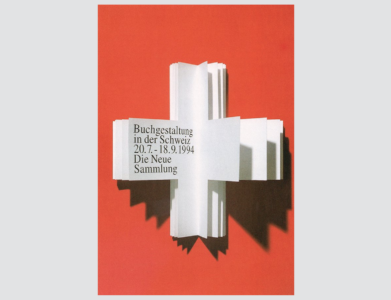
He’s best known for the posters he designed for cultural institutions like Bayerische Staatsoper (the Bavarian State Opera) and Die Neue Sammlung (the International Design Museum in Munich). The concepts were often cleverly literal, like his poster for the former’s exhibition on Book Design in Switzerland, concisely conceived as a folio of crisp, white pages cut in the form of the Swiss cross on a red background, conveying both book and national flag in one fell swoop. Mendell’s connection to our world of furniture design comes in the form of his logo for the famous Vitra group. It’s simple and timeless, doing its job without any fuss, much like the modern furniture that it represents. The visual brand he created over the course of his lifetime is much the same, retaining its relevance today and informing countless creative minds that cross into his orbit.
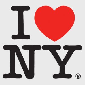
The American, Milton Glaser is a favourite graphic designer of Tom’s. His work is known the world over – perhaps better than anyone else’s in the field. His I♥NY concept is a classic with a legacy extending far beyond Times Square tourist shops. In 1977 Glaser was approached by the State of New York to help lift spirits and stimulate tourism in the wake of financial crisis. His vision was simple, yet enduringly effective. He worked on a pro bono basis to bridge a gap between seeing and understanding, while leaving room for the attachment of individual interpretations and applications. He used typographical font and a voluptuous red heart to drum up associations to the city’s literary legacy coupled with the beating heart of the people who animate it. Nearly half a century later, it’s safe to say he accomplished his mission.
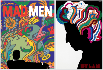
Glaser tended to work in a psychedelic style, sending swirls of colour and form unfurling across the page. He applied the same approach to his posters for the final season of the iconic television show, Mad Men, evoking the spirit of indulgence and creativity that runs rampant throughout the series. In 1967 he created a stylistically similar design in his poster for Bob Dylan’s Greatest Hits album. Glaser drew on canonical references like Marcel Duchamp’s self-portrait to inform the visual structure of the piece. A stark and sombre silhouette of the instantly recognisable musician stands in contemplative contrast against a technicolour head of curly locks. Much like the rest of Glaser’s work, it’s a beautiful and apt characterisation of the subject and all that he stands for.
El Lissitzky wore many hats. The Russian creative worked across art, design, and architecture with a ‘goal-oriented’ approach that helped to found the Bauhaus. He was ingrained in the avant-garde spirit of the early twentieth century, working alongside icons of the Suprematist movement like Kazimir Malevich. Together the group endeavoured to harness and convey ‘the supremacy of pure artistic feeling’ through abstract geometric compositions in basic colours.
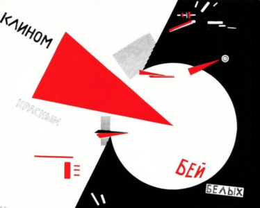
Stylistically, Lissitzky’s graphic designs fall in line with the Suprematist sensibility, expressing political ideas with simplicity and impact. His ‘Beat the Whites with the Red Wedge’ poster, for example, takes a symbolic approach to illustrating and spurring the Bolshevik Red Army’s efforts against the anti-communist White Russians. The poster relies heavily on visual cues, relegating linguistic expression to the back seat. It’s a rather specific application that may not find purchase so widely now; his stylistic approach, however, sent ripples through the history of graphic design and continues to bear influence today.
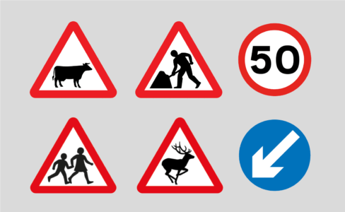
If you’ve ever travelled in the UK, you’ll be very familiar with Margaret Calvert’s work (or we certainly should hope so). Hers is the mind behind the road signs that create a flow of movement throughout the country, as well as the alphabet used across its rail and ferry networks. She worked with colleague, Jock Kinnear to create a visual language so clear, so concise that it could be understood at a flash as you zoom by on the motorway. She had to be direct for the sake of safety, designing an unmistakeable symbolic language that resonates with an entire nation.
Calvert conveyed falling rocks, train crossings, and even cows – which, rather heart-warmingly, were modelled after her favourite bovine companion from childhood named Patience. Each of her designs may not strike the eye a great work of art, but the sum of their parts is. She engineered a collective language that we interact with every day, often so seamlessly that we don’t even notice. In this case, that nearly imperceptible transfer of information and understanding is the mark of a job exceedingly well done.
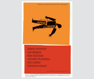
Film buffs will likely recognise the works of Saul Bass by way of cinematic greats like Stanley Kubrik and Alfred Hitchcock. The American graphic maestro was deeply embedded in the film industry, even winning an Oscar for his own cinematic work alongside his wife, Elaine. The pair often collaborated on title sequences for now classics, like Martin Scorsese’s 1995 film, Casino. His blazingly bold graphic style leapt off the page to permeate each picture itself, suffusing the entire film with a certain visual brand.
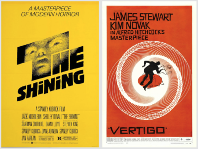
Saul Bass’s film poster for Stanley Kubrick’s The Shining, 1980 (left) + Saul Bass’s film poster for Alfred Hitchcock’s Vertigo, 1958 (right)
Bass’s own brand was characterised by a mid-century modern feel, with fractious blocks of vibrant colour, often yellow and red. There’s an eye-catching sense of dynamism in his posters, capturing the character of these motion pictures which he was often so central in realising. He tended to combine typographical and formal elements to create high-impact focal points. He latched onto a single symbolic object or visual from the film and cast it as part of the title, immersing his graphic designs into the experience of the film as the meaning of the poster changes to viewers once they’ve seen the movie. This deeply embedded approach to graphic design is Bass’s calling card, producing winkingly beautiful adaptations of on-screen brilliance to be rolled up and carried on long after the credits have cut.
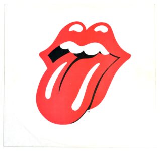
Special mention goes to a graphic design close to Tom’s heart: the Rolling Stones lips. It’s rare that a band is so definitively identified by a logo, making John Pasche’s design a truly distinctive work. The band was in need of a poster for their 1970 European Tour but couldn’t get no satisfaction from what their label produced. So, they called up the Royal College of Art to find some up-and-coming talent. The result was a logo that took hold and held on tight, becoming a visual calling card for the much-loved band as well as a cultural icon.
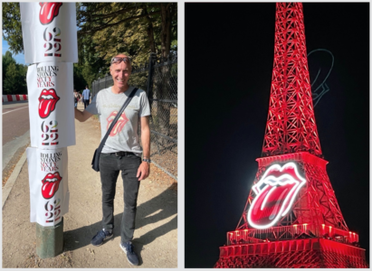
Interestingly, Pasche went on to become Art Director of Chrysalis Records, where Tom worked prior to discovering his knack for furniture design. So, we certainly couldn’t leave this one out! Tom’s been a long-time fan of the Stones, having made his way to their Paris concert just last weekend. By all reports, they are still a strong favourite.
Text by Annabel Colterjohn